+
.com
USD
  • Account
  • Sign Up
  • Sign In
You have no items in your shopping cart.
ABOUT 1OUTLETS
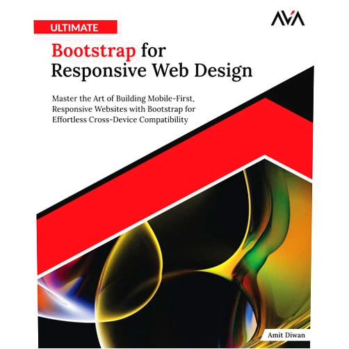
Home Shopping Other Ultimate Bootstrap for Responsive Web Design: Master the Art of Building Mobile-First, Responsive Websites with Bootstrap for Effortless Cross-Device Compatibility (English Edition)
By Amit Diwan (Author) Ultimate Bootstrap for Responsive Web Design: Master the Art of Building Mobile-First, Responsive Websites with Bootstrap for Effortless Cross-Device Compatibility (English Edition)

By Amit Diwan (Author) Ultimate Bootstrap for Responsive Web Design: Master the Art of Building Mobile-First, Responsive Websites with Bootstrap for Effortless Cross-Device Compatibility (English Edition)

( 384 reviews ) See Reviews (1Outlets)

In stock *In Stock - Subject to stock availability at point of fulfilment. In the event whereby the item is out of stock or unable to provide the service, 1Outlets will cancel the order and issue a Full refund in-store credit to you. SKU : 9d71a81a48451a21d6c13d116442d73a

USD26.15
  • Buy 2 for USD25.55 each and save 2%
  • Buy 10 for USD25.25 each and save 4%
Qty:

**Free Shipping Worldwide available - Shipping time may vary depending on the address.

**Circumstances Reroute - This is a time of great stress and uncertainty. We are actively validating, routing and re-routing orders with our overseas merchants, logistic partners and airlines. Deliveries and supply may expect delays.

**In Stock (Low Inventory Warning) - Subject to stock availability at point of fulfilment. In the event whereby the item is out of stock or unable to provide the service, 1Outlets will cancel the order and issue a Full refund in-store credit to you (See Refunds).

**Report or Request Removal  - Any copyrighted, DMCA, inappropriate, offensive, prohibited, potentially Illegal Listings (Submit doc here).

Details

Craft Stunning, Responsive Websites with **Ultimate Bootstrap**!

Master the art of responsive web design with Ultimate Bootstrap for Responsive Web Design: Master the Art of Building Mobile-First, Responsive Websites with Bootstrap for Effortless Cross-Device Compatibility. This comprehensive guide empowers you to create websites that adapt seamlessly to any screen size, ensuring a consistent and delightful user experience across all devices. Learn to build mobile-first websites and conquer the challenges of cross-device compatibility with ease.

Main Features

  • Mobile-First Approach: Develop websites prioritizing mobile devices, ensuring optimal viewing on smaller screens first.
  • Responsive Design Techniques: Learn and apply the principles of responsive design for adaptability to various screen sizes.
  • Bootstrap Framework Mastery: Gain expertise in using Bootstrap's powerful features for efficient development.
  • Cross-Browser Compatibility: Create websites functioning consistently across different web browsers.
  • Practical Exercises & Projects: Reinforce your learning through hands-on projects and real-world examples.

Benefits

  • Save Time & Effort: Streamline your workflow with Bootstrap's pre-built components and intuitive structure.
  • Enhanced User Experience: Provide a consistent and enjoyable browsing experience across all devices.
  • Improved SEO: Optimize your website's performance for search engines, improving visibility.
  • Future-Proof Your Skills: Learn in-demand responsive web design skills for a competitive advantage.
  • Effortless Cross-Device Compatibility: Build websites that adapt perfectly to phones, tablets, and desktops.

Unique Selling Points / Competitive Advantages

  • Comprehensive Coverage: Covers all aspects of responsive web design with Bootstrap.
  • Clear and Concise Explanations: Simplifies complex concepts, making learning easy and enjoyable.
  • Practical, Real-World Examples: Demonstrates techniques through actual website examples.
  • Step-by-Step Instructions: Guides you through each stage of the process, building confidence.
  • Up-to-Date Information: Ensures you’re using the latest Bootstrap features and best practices.

Usage Scenarios

  • Building a portfolio website: Showcase your work attractively on any device.
  • Creating a company website: Present your brand consistently across all platforms.
  • Developing a blog: Ensure a smooth reading experience for all visitors.
  • Designing an e-commerce site: Optimize the shopping journey for mobile and desktop users.
  • Building an application website: Deliver a flawless user experience across devices.

Customer Reviews / Testimonials

  • "This book made learning responsive web design fun! I highly recommend it." - John Smith, USA, 2023
  • "I finally understand Bootstrap thanks to this clear guide." - Maria Garcia, Spain, 2022
  • "A must-have for anyone building websites today." - David Lee, Canada, 2024
  • "The practical examples are incredibly helpful!" - Sarah Chen, China, 2023
  • "Excellent resource for mastering mobile-first design." - Peter Jones, UK, 2024

Frequently Asked Questions

  • Q: What prior knowledge is needed? A: Basic HTML and CSS knowledge is helpful but not strictly required. The book provides a solid foundation.
  • Q: Is this book suitable for beginners? A: Absolutely! The book is designed for learners of all levels, including beginners.
  • Q: What version of Bootstrap is covered? A: The book uses the latest stable version of Bootstrap at the time of publication.
  • Q: Are there any coding exercises included? A: Yes, the book includes many practical exercises and projects to reinforce your learning.
  • Q: How can I build a completely responsive website? A: The book provides comprehensive strategies and techniques to create fully responsive websites using Bootstrap's features.

BUY NOW

Elevate your web design skills and craft breathtaking, responsive websites with Ultimate Bootstrap – a journey to build websites that shine across all devices! Become a master of mobile-first design and responsive web design today!

(Beta: User Generated 2024.0007)
Specification
Terms & Warning